

Transform Your Space with Expert Interior Design Insights
Unlock the full potential of your Images with interior design recommendations tailored to your style. Request any image and receive a curated design brief that turns inspiration into action.
- Primary Color Palette A refined, harmonious palette extracted directly from your image — perfect for guiding décor, furniture, and styling decisions.
- Paint Recommendations From Top Brands Matching shades from leading paint companies such as Sherwin‑Williams, Benjamin Moore, Behr, and Valspar and others, ensuring you can bring your vision to life with confidence.
- Best Locations to Use Each Color Clear, practical guidance on where each color works best — accent walls, trim, ceilings, feature zones, or full‑room applications.
Why It Works
-
Your image becomes the blueprint. Our system analyzes lighting, materials, and mood to deliver design recommendations that feel intentional, cohesive, and ready for real‑world execution.
Perfect For
- Confirmation of existing decor cohesion
- Homeowners refreshing a room
- Designers seeking quick inspiration
- Real estate staging
- Renovation planning
- Anyone who wants a beautiful, balanced space
Example
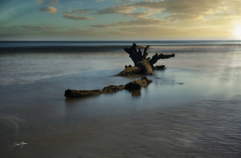
Driftwood Serenity - (What You’ll Get)
1. Primary Color Palette Fill
Here are the dominant and supportive tones extracted from the artwork:
-
Soft Blue 🌊
Hex: #A4C8E1
A calming hue that evokes tranquility and peace, reminiscent of serene waters. -
Muted Green 🌿
Hex: #B7C9A8
A gentle, earthy tone that connects to nature, promoting a sense of balance and harmony. -
Warm Beige 🏖️
Hex: #D6CFC4
A soft, neutral shade that adds warmth and comfort, enhancing the inviting nature of the piece. -
Rich Brown 🌳
Hex: #7B5B3A
A grounding color that reflects the driftwood's texture, adding depth and stability. -
Soft Gray 🌫️
Hex: #B0B3B8
A versatile shade that complements the artwork's light and shadow play, creating a serene backdrop.
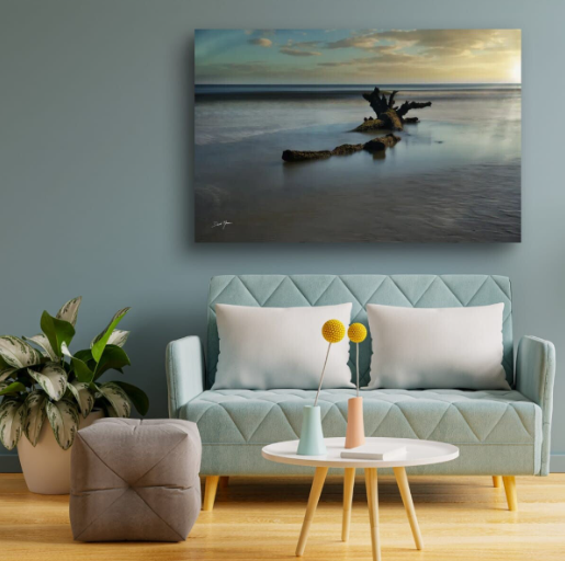
2. Complementary Interior Palette
These colors will harmonize beautifully with the artwork:
-
Sherwin-Williams Sea Salt 🌊
Sherwin-Williams Sea Salt
A soft, muted green that brings a refreshing feel to any space. -
Benjamin Moore Revere Pewter 🏡
Benjamin Moore Revere Pewter
A warm gray that adds sophistication and pairs well with natural elements. -
Behr Sandstone Cliff 🏜️
Behr Sandstone Cliff
A warm beige that enhances the cozy feel of the room. -
Valspar Ocean Breeze 🌬️
Valspar Ocean Breeze
A light blue that evokes the calmness of the sea, perfect for a tranquil atmosphere.
3. Styling Suggestions
-
Pair this piece with a soft sage wall and charcoal gray furnishings for a calming effect. This combination will create a serene environment that invites relaxation.
-
This art will pop beautifully on an off-white wall with warm wood accents. The natural tones will enhance the artwork's organic feel, making it a focal point in the room.
-
Consider placing the artwork above a low-profile, neutral sofa with textured throw pillows. This setup will draw attention to the piece while maintaining a cohesive look.
4. Audience Consideration
Imagine welcoming guests into a space that radiates tranquility and connection to nature. The serene landscape of "Driftwood Serenity" invites contemplation and reflection, making it a perfect addition to your home. Whether in a cozy reading nook or a spacious living room, this artwork encourages moments of peace and connection. By incorporating soft, natural colors and textures, you can create an inviting atmosphere that resonates with your lifestyle and values.
Fill out the form below to receive your FREE Interior Design Insights!
Add the image name and number you're interested in the message box below.